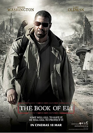
The style of this, The Book Of Eli, poster is very dramatic, the camera work used is a medium shot showing most of the body of the main character and some of the scenery, this is done to show the main character and also to show the setting of the film and to give you a basis of what the film will be about. The poster also shows you the setting because it wants to give you an idea of genre. The poster really represents the dystopian genre because of the clothing the main character is wearing and the setting is destroyed and ruined. The text is quite small which allows room for the scenery to be seen so that you know the film is post apocalyptic. The colors of this poster are very grey showing the destruction of the landscape throw nuclear war and also represents the breakdown in society but the beam of white shows some sort of glimmer of hope. The beam of white in the poster could also relate to the 4th stage of Todorovs narrative theory which shows an attempt of repair from the main character, because it is a metaphor for light in a world of darkness.

The style of this Mad Max Fury Road poster is very similar in terms of the style as my first example by trying to set the scene for the audience and to also give them an idea of the story line but this poster as a different camera shot, it uses a long shot to show the scene and a person from the film. The Mad Max poster really suits the genre of the film due to the scenery being destroyed and nothing around. This poster shows a lot of the scenery but at the same time has the title quite big and bold which adds to the poster rather than take your attention away from the scenery, the font of the title also fits in well with the style of the poster and also is corroded which also represents the story in terms of being post apocalyptic. The colors of the poster is also quite minimal and looks quite washed and I feel this works quite well with the setting of the film and also the story line and fitting in with the post apocalyptic and dystopian. In particular the yellow tones in the poster represent the natural landscape but also how the natural landscape has become ruined and not maintained. Themes that connect dystopian films are destruction of the landscape due to biological or nuclear warfare or disease. The yellow tones in the soil have connotations of a wasteland this combines with the gray and green clouds to suggest a poisonous atmosphere and to shoe something bad may be coming. This links to Todorovs narrative theory of the disruption.
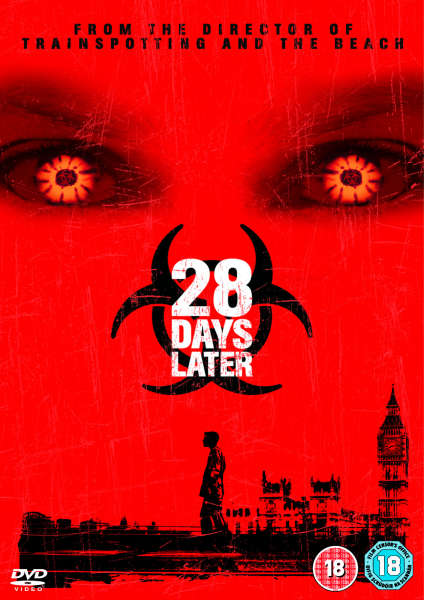
This poster for 28 days later is very different as it used edited pictures in stead of showing scenery from the film and this makes it very different to the other two, but it does tell a little about the story line by showing the main character walking on his own through London. The effect the eyes have is it shows the audience that there is some type of infection as the eyes look unhuman like. The text is positioned in the center but whats different with this one then the other two is that it has a biohazard symbol behind it showing that it is a virus that has effected the world and turning them into zombies.
The colors used are a lot of red which represents the virus and also represents blood, death and zombies and also because the red takes over most of the poster and the size of the uneffected person and the big ben represents how the virus has taken over the world. The colors represent the 2nd stage of Todorovs narrative theory of disruptions to the equilibrium which in this case would be the virus.


